Design
Throughout my time as a journalist for Scot Scoop, I have been taught again and again that visuals play a crucial part in the success and readability of a story. The designs displayed below all aided my articles to look more interesting, by adding colors like for the feature photos, or by adding information in interesting ways like for the infographics.
Highlander Magazine


I designed this feature photo to incorporate both the Girl Scouts and their cookies, which was the topic of the article. For the design, I used Photoshop to paint the Girl Scout vest and put their cookies as the back layer. I placed the cookie boxes together and then I made them more transparent, to make the vest stand out more. I also placed a white layer behind the vest to create a bigger contrast from the background.
For this feature photo, I was mainly focusing on the topics brought up in the article. The article is about the comparison between the value of higher education diplomas, demonstrated on the right, and the numerous supplies and steps it takes to attain it, on the left. Considering this article is a comparison, I chose to place the images on a scale, and have multiple needs in the middle, meant to demonstrate the balance is not decided. I used Canva to make this design.
This article mentioned many different events taking place in different locations around the world. Referring to these various statistics can be confusing without any sort of visual reference, which this infographic was meant to aid with. Genial.ly was great for this as it also has interactive tools to include additional information as well.
Using Infogram, I was able to highlight the more statistical aspects of this article. Including too many facts directly in the body of the article could've been unappealing or unenjoyable for readers, so I decided to use. aninfographic instead. Using a time line format and different colors, I was also able to make it more visually clear.
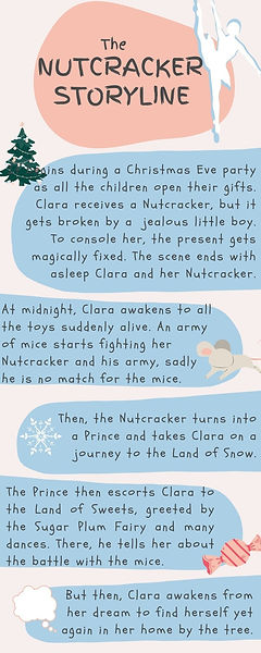
Because this article told the story of one person and revolved around a specific time span where multiple events occurred, I decided to make a timeline. Using Infogram, I could also make it interactive to make the events closer together more clear to readers. I also decided to use numerous different colors, so that each event could have its own color to make it more easily differentiable.
For this infographic in Urvi Kulkarni's and my article about Earth Day, I wanted to include brown and green tones that are reminiscent of Earth tones. I also wanted to emphasize the amount of people impacted from climate issues, to highlight the numbers in the article, which I did through these diagrams. By putting the numbers through charts, tables, and visuals, the readers have more opportunities to understand the numbers in the way that works best for them, which is what I was aiming for.
Both of these infographics were featured in the same article, so I decided to use the same color scheme for all of them, as well as for the feature photo. I used the interactive features of Infogram to clarify the numbers and their proportions to readers, and with its visual demonstration through the charts, makes it accessible to readers. I also purposefully featured the same schools in both of the infographics, to display information that is comparable in both, but still relevant to the article.
Canva Infographics
These infographics all use visuals and colors coordinating with the articles to portray information in a more easily comprehensible manner to readers.